Conversion analysis (aka funnel analysis) is the most frequently performed analysis in every SaaS company.
Almost every metric you look at is a conversion rate:
- Visitor-to-signup %
- Activation rate (setup/aha/habit)
- Trial-to-paid %
- Email open/click through %
- Cohort retention rate (day/week/month-N)
On the surface, the calculation looks straightforward:
Pretty simple, right? However, the devil is in the details.
There are a few extra factors that often get overlooked, preventing teams from getting real insights and taking effective actions.
To my surprise, I couldn’t find any in-depth articles on the subject, so I decided to put together this guide to help my fellow SaaS practitioners.
Don’t worry, there is no complicated data science or math, just good analytics practice built into how B2B SaaS companies operate. There is a good chance that you are already familiar with some of these concepts, so feel free to skip ahead to relevant sections.
-
- Unique vs. total conversions
- Track the same users
- The importance of time-bound conversions
- The order of conversion steps doesn’t have to be strict
- Segment by first-time vs. repeated entry, lifecycle stage, and user role
- Beware of segmentation biases: Sample size omission and Simpson’s paradox
- Measure conversions at the right level
- What is a good conversion rate?
Now, let’s get right into it.
Unique vs. total conversions
I know this is Analytics 101 stuff, but you would be surprised by how many people fail to distinguish these two conversion metrics.
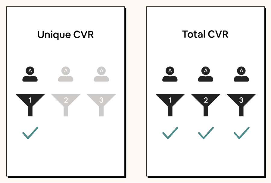
Unique conversions measure whether each unique user completes a funnel at least once. The result is a binary yes or no.
This is best used when the funnel can be completed only once per user or when you don’t care about the number of conversions per user.
Examples:
- Visitor-to-signup conversion
- Trial-to-paid conversion
- Signup-to-aha conversion
Over 95% of the conversion analyses you do will fall into this category. This is the default definition used whenever someone says “conversion analysis.”
Total conversions measure whether each funnel entry results in a conversion, including repeated entries from the same user.
Example: % of invitations sent that result in a referred user.
Practically speaking, this isn’t as commonly used in B2B SaaS compared to e-commerce or social products. When it does get used, it’s usually to find out the “intensity” of product usage, and the result is often presented as an average (mean/median) or a distribution (histogram).
Track the same users
It still shocks me how many SaaS companies calculate conversion rates using the following calculation:
(# of users who entered the funnel in a period / # of users who completed the funnel in the same period) X 100
I know some of you might be wondering, “What’s wrong with that?”
The problem has to do with the conversion time. Because there is a gap between the time when users enter the funnel and the time when they complete the funnel, the numerator and the denominator might not represent the same group of users.
This is not a big issue if the expected time to convert is within one day, such as visitor-to-signup conversion. However, it will be extremely misleading if you are measuring a funnel that takes at least multiple days to complete.
To see the conversion trend, you have to group users based on the period in which they enter the funnel.
Let’s look at an example:
- You want to track your trial-to-paid conversion rate.
- The trial is 30 days, so it takes a user at least 30 days to convert.
- For this demonstration, we’ll pretend that every conversion happens immediately at the end of a trial.
This is what the 5-month data will look like:

As you can see, while the real conversion rate remains the same each month, the fake conversion rate is heavily impacted by fluctuations in the new trial count.
If you use the wrong calculation, you would think, “Oh, the conversion rate went up/down, it must be something we did. Let’s double down on/stop doing it!”
You would not want to get misled like this.
The importance of time-bound conversions
A conversion window defines the time a user has to complete a funnel. If a conversion falls outside the conversion window, it won’t count as a success. This is the most overlooked aspect of conversion analysis, but it’s an absolute must-have.
Why is a conversion window important? Let’s look at an example.
Say you want to measure your activation rate…
This is the conversion trend with a 7-day conversion window vs. the conversion trend without it.
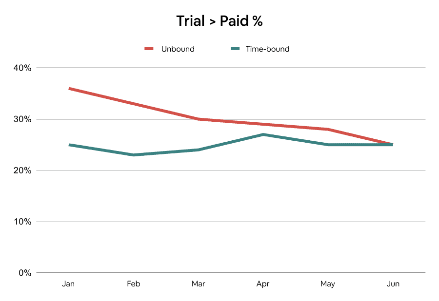
Huh? Why is there such a difference?
In the first graph, it might seem like things are trending down. However, that’s not necessarily because newer cohorts are converting worse. It could simply be because older cohorts are given a longer time to convert.
Successful conversions in this case may include users who come back one year after signing up. Perhaps they couldn’t figure out how to use the product the first time, but decided to give it another try after seeing your company’s recent funding news. Whatever the reason might be, you can bet that their return has very little to do with the onboarding flow.
If you don’t add a time-bound condition, you will either waste time fixing a non-issue or, worse, abandon all the progress you’ve made in your activation.
To put it another way, it’s like trying to find out which generation is better at investing by comparing the percentage of millionaires in each generation today. The older generations will most likely come out on top, not necessarily because they are financially savvier, but rather because they have had significantly more time to save and invest.
Another common example in SaaS is cohort (period-N) retention. When you measure retention, make sure you look at the percentage of users who return exactly in period N, not in or after (unbound retention) for this same reason.
“But this means we don’t see the real conversion rate.”
True, but the goal of an analysis is to help you take action. You can wait 10 years to make sure you have data that will remain unchanged, but how does that help?
The order of conversion steps doesn’t have to be strict
We usually view a funnel as a set of steps that must be completed in a specific order.
While this is true for funnels like a sales pipeline (e.g., contacted > demo given > closed), it’s not always the case for in-product flows, such as signup-to-habit conversions.
Teams that get stuck in this linear thinking will either:
-
- Struggle to define the conversion funnel because they are not sure if the order is right.
- Define an impartial funnel that doesn’t allow them to track other conversion paths, hence preventing them from capturing the overall conversion rate.
If the conversion goal you’re measuring can be achieved through multiple paths, it’s perfectly fine not to assign a specific order.
For example, let’s say your product is a video editor:
-
- You know that users who edit clip length, change frame rate, and add an effect within the first day will have the best chance of continuing to use the product, so you want to run experiments to push these behaviors.
- However, you can’t identify a specific order in which users complete these steps because every video is different.
You can then define your funnel as:
Having a flexible order helps you avoid getting blindsided by a narrowly-defined metric, but that doesn’t mean you can’t try to identify an ideal path and nudge users toward it.
Sometimes you might also have alternative options within your funnel. For example, perhaps adding visual effect (1A) and sound effect (1B) are equally effective, but a user rarely performs both. In that case, you want to set up your analysis to count either action as a conversion.
Enjoying this post so far? Subscribe for more.
Segment by first-time vs. repeated entry, lifecycle stage, and user role
If the same user can repeatedly enter a funnel, you likely want to separate each user’s first attempt from the rest.
Why? Let’s say your product is a CRM app, and you want to understand what percentage of users who click “import contacts” complete the flow in order to improve it.
That first interaction gives you the most accurate sign of whether the flow is intuitive enough. By the time a user starts the flow for the second time, they might have already learned the feature’s quirks. If you mix the two scenarios, the result will be highly impacted by the ratio of new vs. repeated users.
“Ok, so I just have to use unique conversions. Got it.”
Actually, that’s not enough. Assuming you want to monitor this flow’s monthly conversion trend, the definition of a “unique user” will reset in each interval. In other words, a user who started the flow in March and April will show up as a unique count in both months, respectively. To avoid double counting, make sure to identify a user’s first attempt ever.
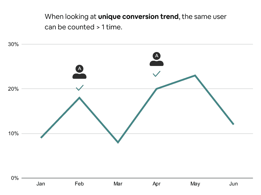
Also, a user who attempted their first import within the first day of signing up (e.g., migrating from another tool) likely has a different mindset compared to users who do so in their sixth month (e.g., adding additional leads collected from a one-off campaign).
If you don’t want to mix the two groups together, you need to segment by user lifecycle stage. The most common way to do so is by using “time since sign up,” but you can also use a more advanced definition, such as:
- Time since meeting a criteria
- Product usage in the current calendar period
If you have a multi-player product, it also makes sense to segment by user role. For example, a design tool usually includes two types of users:
- Designers who use it to create designs
- PMs / engineers who use it to give design feedback
As the two roles have very different jobs to be done, you wouldn’t want to mix them together when asking, “What percentage of new users create a new design on day 1?”
Beware of segmentation biases: Sample size omission & Simpson’s paradox
When you compare different segments’ conversion rates, one crucial variable will be hidden in the result: The weight of each segment relative to the total number of users who entered the funnel.
Say that your visitor-to-signup % by region looks like this:
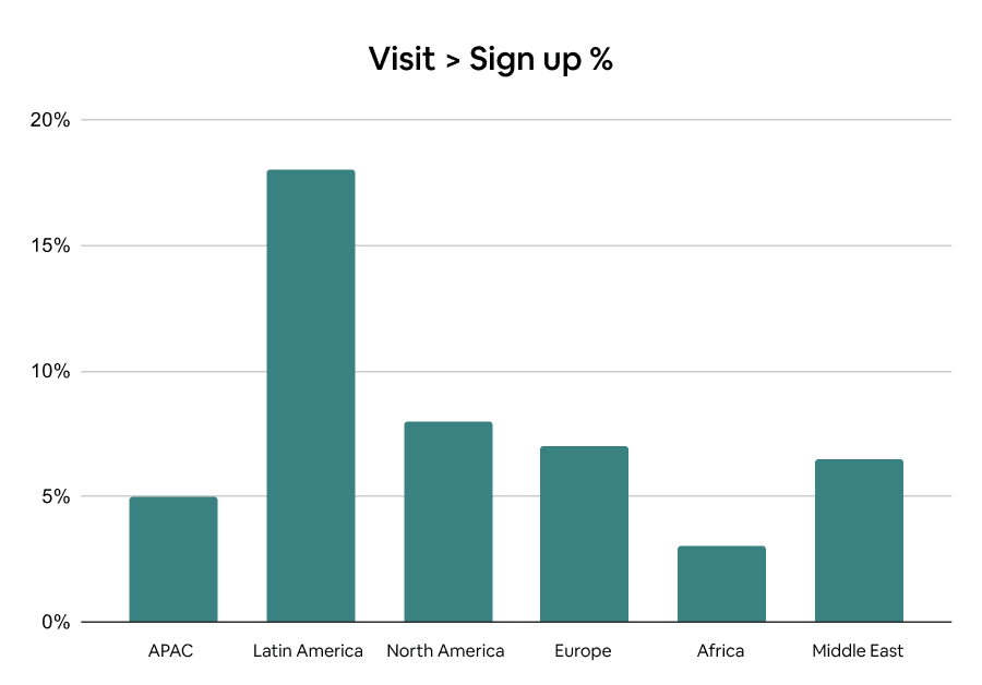
You might jump to the conclusion that Latin America has the highest conversion rate, so you should double down on the region. In reality, the segment might be only a tiny portion of your visitor count, and the high conversion rate is simply an anomaly caused by an extremely small sample size.
When segmenting the result of an A/B test, you might run into an even more bizarre phenomenon called Simpson’s paradox. This paradox happens when a trend across individual segments is different from the result of combined data.
For example, below is the result of an A/B test aimed at improving trial-to-paid conversions:
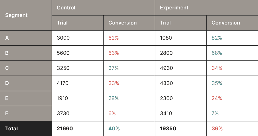
Although the experiment group converts better across all segments, the control group performs better when the data is combined. Pretty weird, right?
It’s important to point out that these scenarios are labeled as “biases” only because they can be misleading. It doesn’t mean they are wrong.
How you interpret the data will depend entirely on your business context. Sometimes you care more about certain segments, other times you care more about the overall. You have to apply your qualitative judgment to make the call.
Measure conversions at the right level
I’ve used “users” in my examples throughout the article, but sometimes you have to track conversions at different levels — company, team, workspace, project, and whatever concepts you have in the product.
For instance, if your product allows a company to own multiple workspaces, and each workspace is billed separately, the subject of your subscription-related conversion analyses should be either “companies” or “workspaces.”
However, if you want to measure the conversion rate of a feature’s setup flow that can be used by any user within a workspace, it would make more sense to do so at the user level.
What is a good conversion rate?
People often try to evaluate whether a conversion rate is good or not based on its absolute value. But that’s simply incorrect.
A conversion rate of 8% might seem low, but it is considered good if it represents the signup-to-paid percentage of an enterprise SaaS product that costs hundreds of dollars per year.
On the other hand, a conversion rate of 80% might seem high, but it is considered bad if it represents the percentage of customers that log into the product after upgrading.
Asking “what is a good conversion rate?” is like asking “how long is a piece of string?” You can’t answer it without having more context.
Industry benchmarks might offer some high-level signals, but they also come with lots of noise. You have to combine them with your own data and intuition to prioritize your most pressing metrics.
Remember, the goal of analyses is to help you take better actions. Whether you have a good conversion rate today does not matter that much. What matters is that you consistently put in the work to make it better tomorrow.
